Introduction
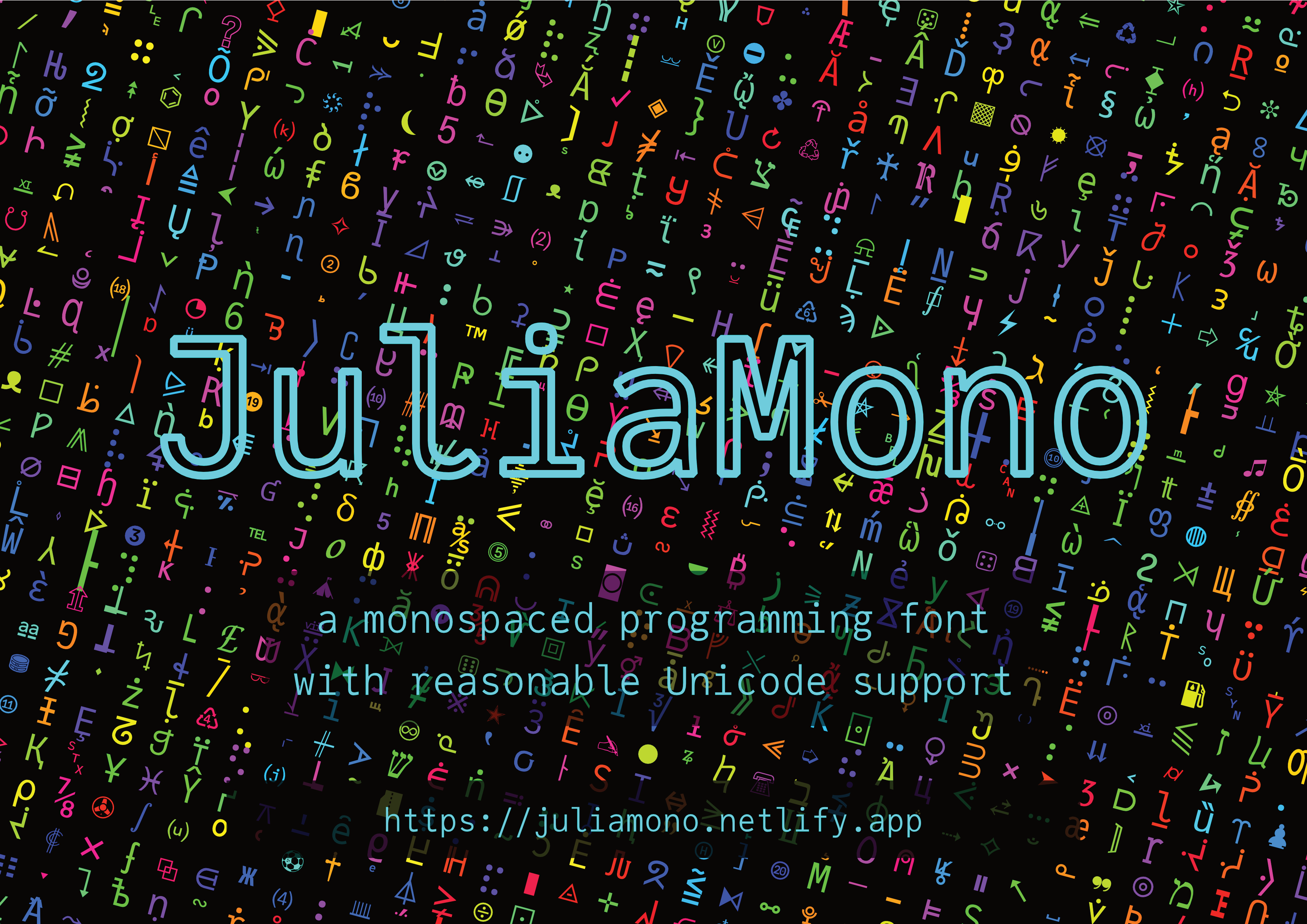
JuliaMono is a monospaced typeface designed for programming and other text editing environments that require a wide range of specialist and technical Unicode characters. It was presented at the 2020 JuliaCon conference, which was to have been held in Lisbon, Portugal, but instead took place online.
JuliaMono is:
free (but you can buy me a ☕️!)
distributed with a liberal licence [1]
suitable for scientific and technical programming as well as for general purpose hacking
full of Unicode goodness
easy to use, simple, unquirky, friendly, and approachable
available for MacOS, Unix, and Windows [2]
This site uses JuliaMono for all text; if your browser can’t[3] (or you didn’t allow it to) download and display web fonts, you’ll only see the font in action in the images. You’ll see three large dots here when/if the font has been successfully downloaded:
( )To download and install JuliaMono, see the instructions here.
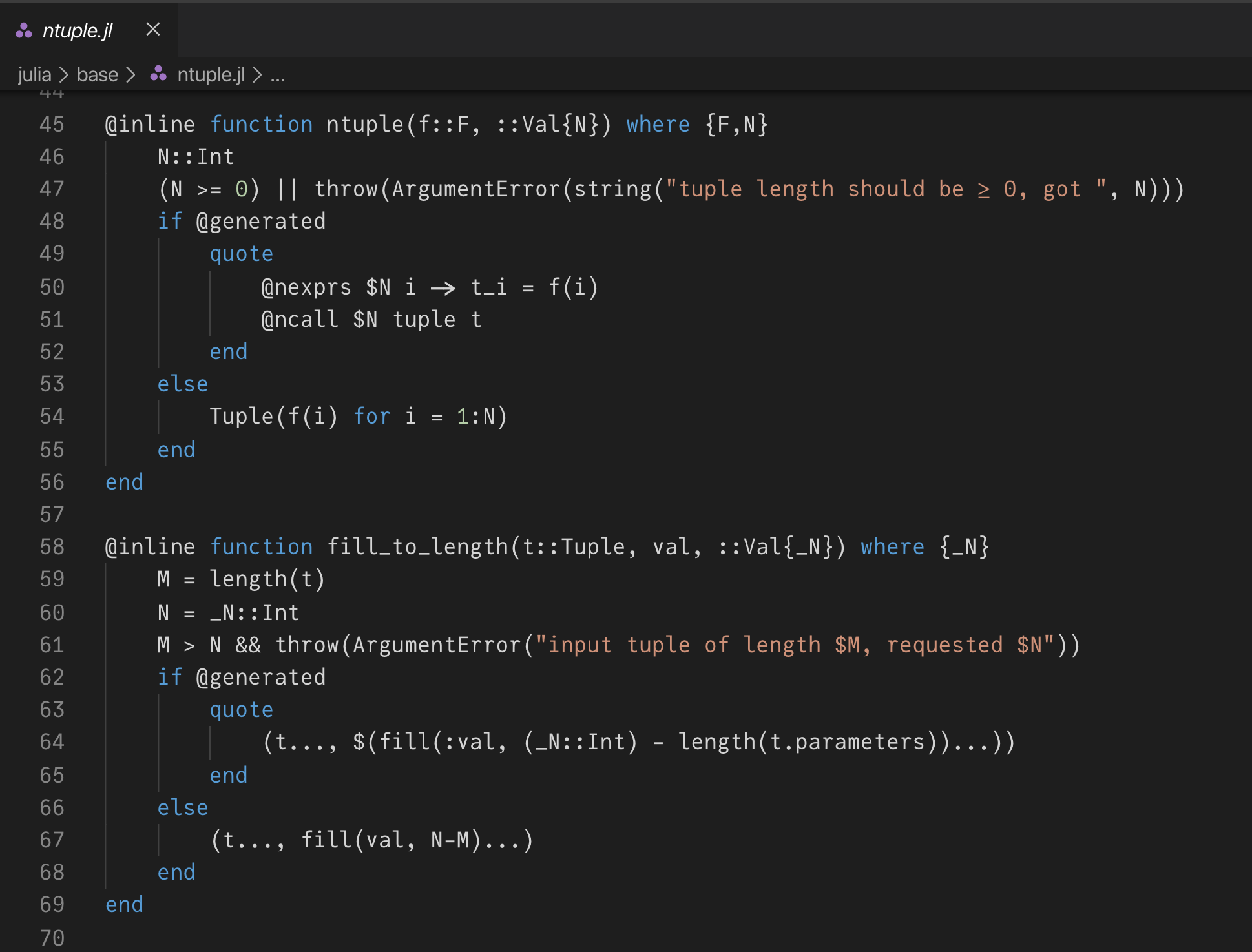
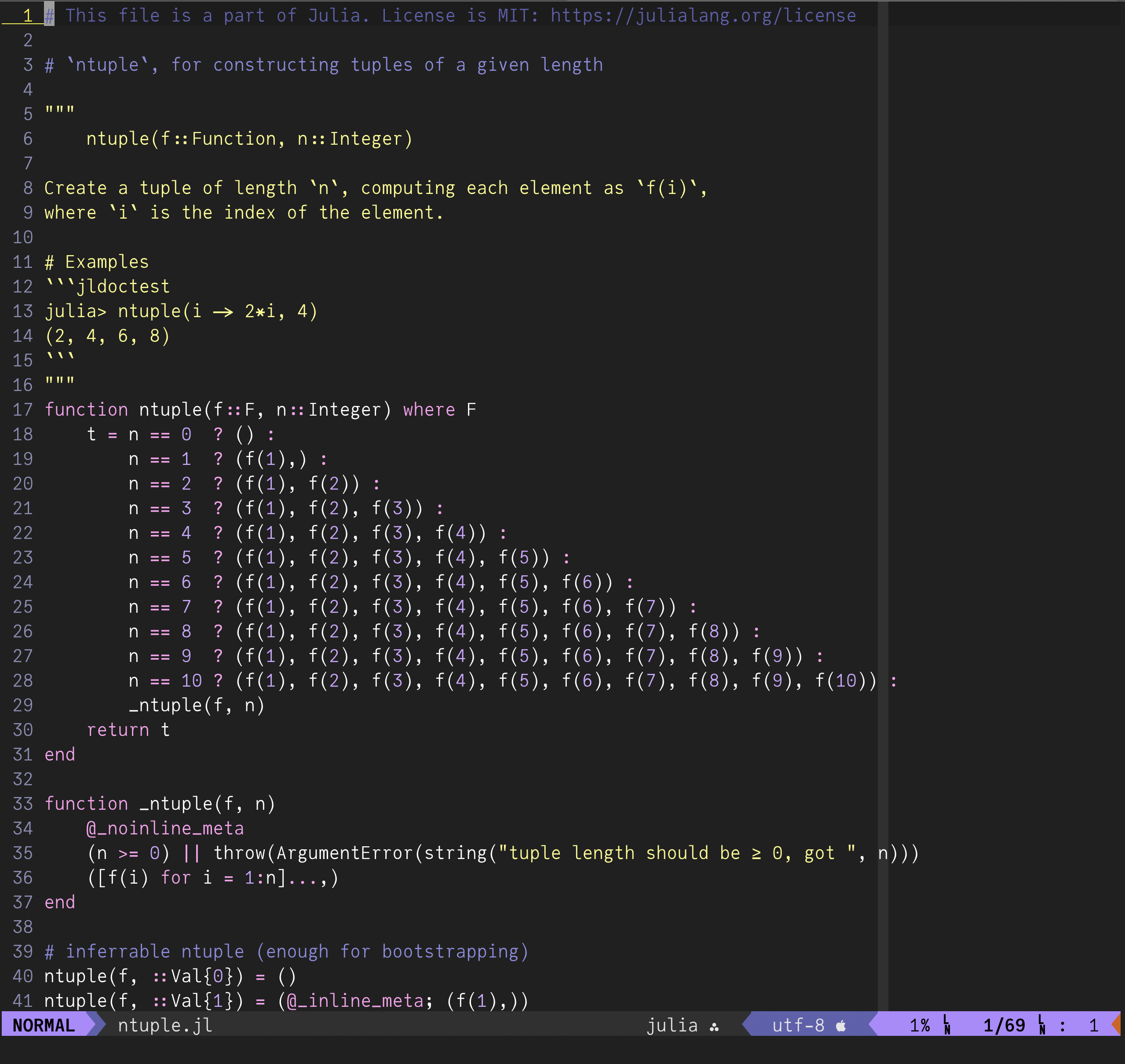
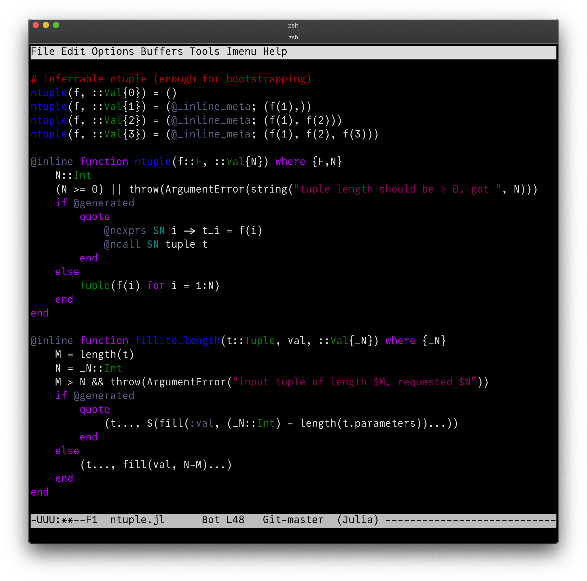
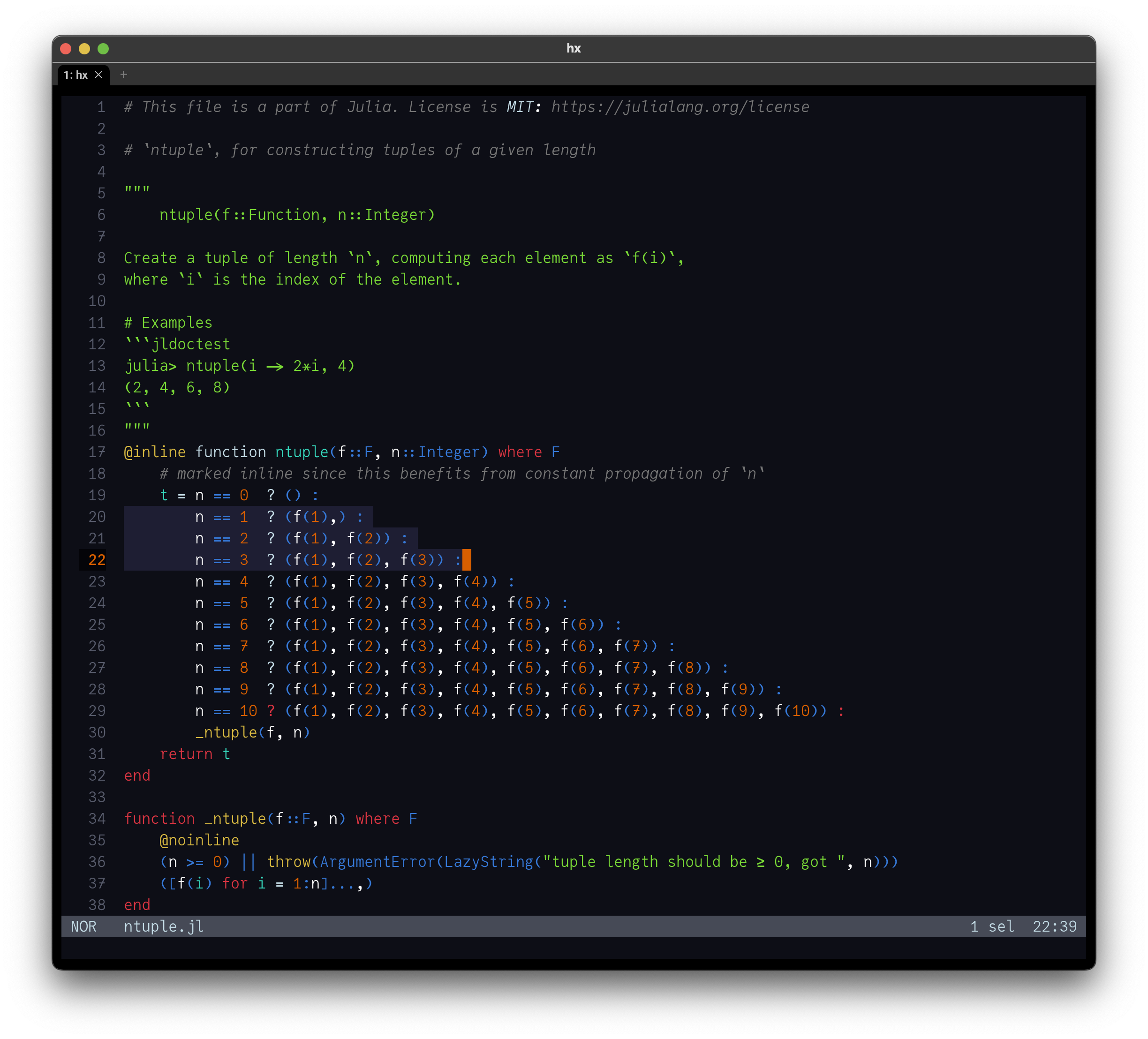
Screenshots
In VS Code.

In Vim:

In Emacs:

In Helix:

Examples
The following examples will be rendered in JuliaMono by your browser (if it’s successfully downloaded the web font versions), so I hope what you see here is close to what I made.
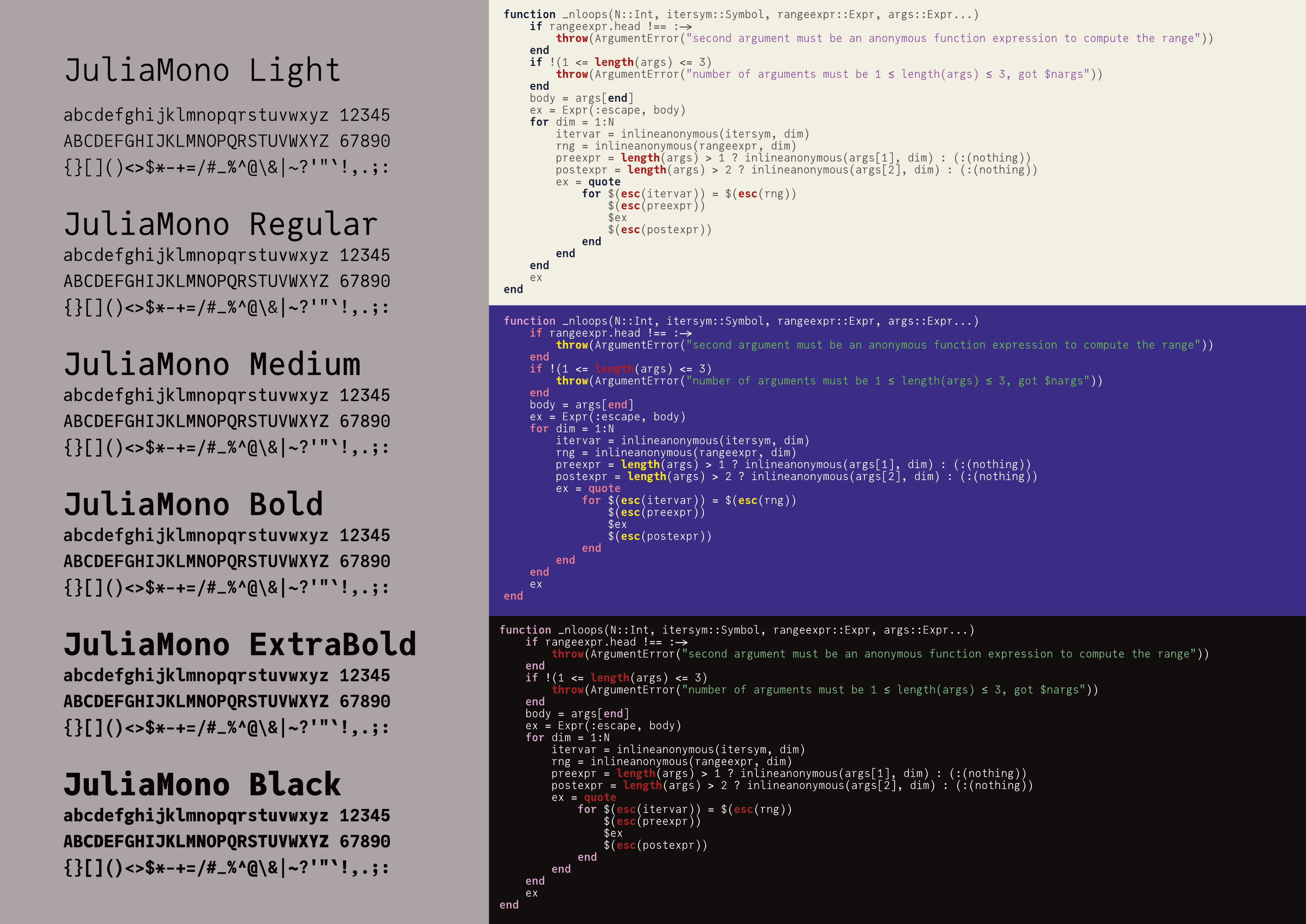
There are different weights of JuliaMono[4], so you can control the amount of contrast you have in your highlighted code:
JuliaMono-Light JuliaMono-Regular JuliaMono-Medium JuliaMono-Bold JuliaMono-ExtraBold JuliaMono-BlackThey all occupy the same amount of horizontal space, so they can be mixed without losing alignment.
The CSS markup applied to the following code uses another weight of the typeface, JuliaMono-Medium, which is a smidgeon bolder:
using Zygote: @adjoint
function ignore(f)
try return f()
catch e;
return 0;
end
end
@adjoint function ignore(f)
try Zygote._pullback(__context__, f)
catch e
0, ȳ -> nothing
end
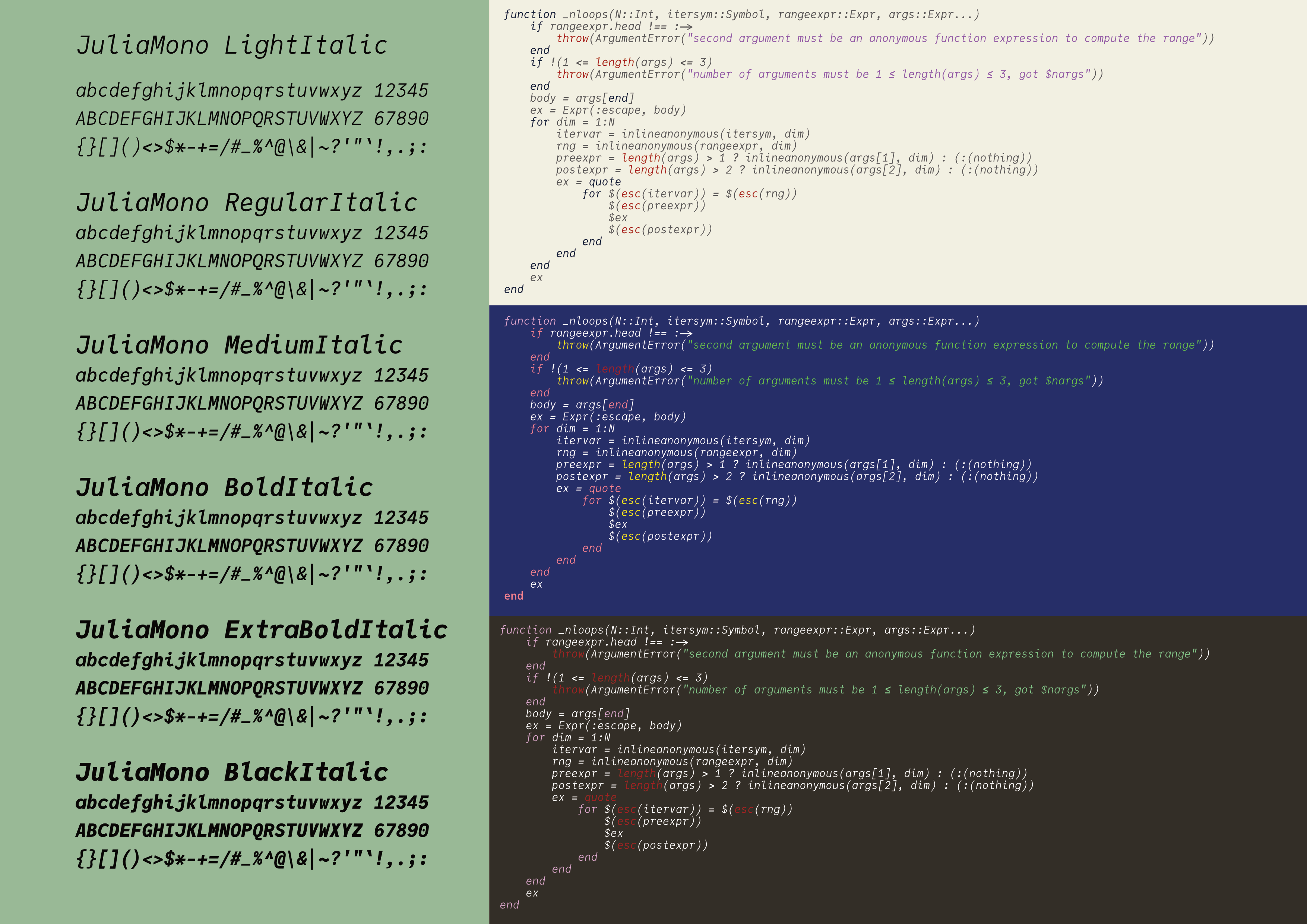
endEach weight has a matching italic variant: so JuliaMono-Light has JuliaMono-LightItalic, and so on.
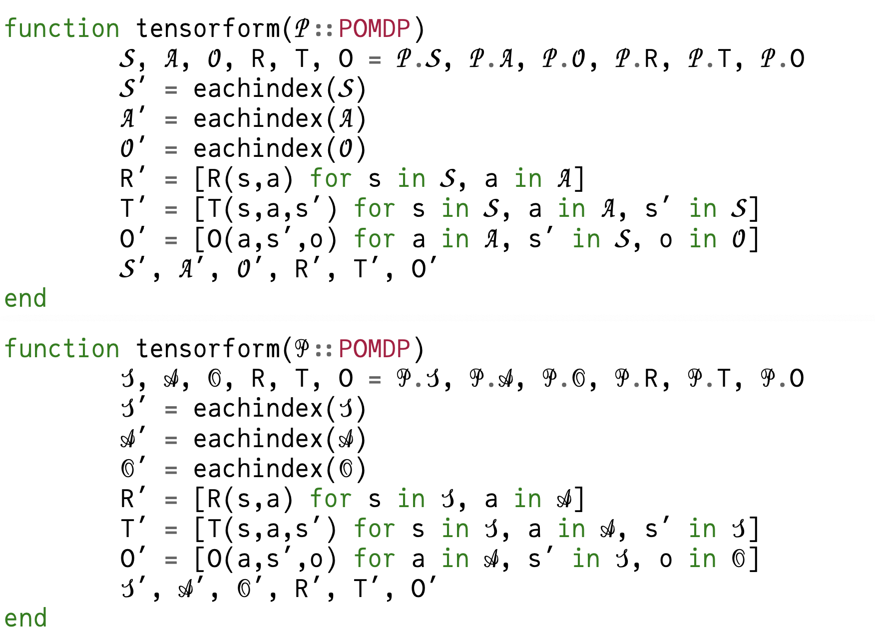
JuliaMono-LightItalic JuliaMono-RegularItalic JuliaMono-MediumItalic JuliaMono-BoldItalic JuliaMono-ExtraBoldItalic JuliaMono-BlackItalicIn the hands of a virtuoso (such as Dr Zygmunt Szpak, the author of the following Julia code fragment[5]), the range of available Unicode characters can be quite expressive:
function T(𝛉::AbstractArray,
           𝒞::Tuple{AbstractArray,
           Vararg{AbstractArray}},
           𝒟::Tuple{AbstractArray, Vararg{AbstractArray}})
    ⊗ = kron
    l = length(𝛉)
    𝐈ₗ = SMatrix{l,l}(1.0I)
    𝐈ₘ = SMatrix{1,1}(1.0I)
    𝐓 = @SMatrix zeros(l,l)
    N = length(𝒟[1])
    ℳ, ℳʹ = 𝒟
    Λ₁, Λ₂ = 𝒞
    𝚲ₙ = @MMatrix zeros(4,4)
    𝐞₁ = @SMatrix [1.0; 0.0; 0.0]
    𝐞₂ = @SMatrix [0.0; 1.0; 0.0]
    for n = 1:N
        index = SVector(1,2)
        𝚲ₙ[1:2,1:2] .=  Λ₁[n][index,index]
        𝚲ₙ[3:4,3:4] .=  Λ₂[n][index,index]
        𝐦    = hom(ℳ[n])
        𝐦ʹ   = hom(ℳʹ[n])
        𝐔ₙ   = (𝐦 ⊗ 𝐦ʹ)
        ∂ₓ𝐮ₙ = [(𝐞₁ ⊗ 𝐦ʹ) (𝐞₂ ⊗ 𝐦ʹ) (𝐦 ⊗ 𝐞₁) (𝐦 ⊗ 𝐞₂)]
        𝐁ₙ   = ∂ₓ𝐮ₙ * 𝚲ₙ * ∂ₓ𝐮ₙ'
        𝚺ₙ   = 𝛉' * 𝐁ₙ * 𝛉
        𝚺ₙ⁻¹ = inv(𝚺ₙ)
        𝐓₁   = @SMatrix zeros(Float64,l,l)
        for k = 1:l
            𝐞ₖ = 𝐈ₗ[:,k]
            ∂𝐞ₖ𝚺ₙ = (𝐈ₘ ⊗ 𝐞ₖ') * 𝐁ₙ * (𝐈ₘ ⊗ 𝛉) + (𝐈ₘ ⊗ 𝛉') * 𝐁ₙ * (𝐈ₘ ⊗ 𝐞ₖ)
            # Accumulating the result in 𝐓₁ allocates memory,
            # even though the two terms in the
            # summation are both SArrays.
            𝐓₁ = 𝐓₁ + 𝐔ₙ * 𝚺ₙ⁻¹ * (∂𝐞ₖ𝚺ₙ) * 𝚺ₙ⁻¹ * 𝐔ₙ' * 𝛉 * 𝐞ₖ'
        end
        𝐓 = 𝐓 + 𝐓₁
    end
    𝐓
end
Languages
Here are some samples of various languages[6] :
| Ancient Greek | Ἄδμηθ’, ὁρᾷς γὰρ τἀμὰ πράγμαθ’ ὡς ἔχει, λέξαι θέλω σοι πρὶν θανεῖν ἃ βούλομαι. |
| Armenian | Իմ օդաթիռը լի է օձաձկերով |
| Bulgarian | Я, пазачът Вальо уж бди, а скришом хапва кюфтенца зад щайгите. |
| Catalan | «Dóna amor que seràs feliç!». Això, il·lús company geniüt, ja és un lluït rètol blavís d’onze kWh. |
| Czech | Zvlášť zákeřný učeň s ďolíčky běží podél zóny úlů |
| Danish | Quizdeltagerne spiste jordbær med fløde, mens cirkusklovnen Walther spillede på xylofon. |
| English | Sphinx of black quartz, judge my vow. |
| Estonian | Põdur Zagrebi tšellomängija-följetonist Ciqo külmetas kehvas garaažis |
| Finnish | Charles Darwin jammaili Åken hevixylofonilla Qatarin yöpub Zeligissä. |
| French | Voix ambiguë d’un cœur qui au zéphyr préfère les jattes de kiwi. |
| Georgian | სწრაფი ყავისფერი მელა ახტება ზარმაც ძაღლს. |
| German | Victor jagt zwölf Boxkämpfer quer über den großen Sylter Deich. |
| Greek | Ταχίστη αλώπηξ βαφής ψημένη γη, δρασκελίζει υπέρ νωθρού κυνός. |
| Guarani | Hĩlandiagua kuñanguéra oho peteĩ saʼyju ypaʼũme Gavõme omboʼe hag̃ua ingyleñeʼẽ mitãnguérare neʼẽndyʼỹ. |
| Hungarian | Jó foxim és don Quijote húszwattos lámpánál ülve egy pár bűvös cipőt készít. |
| IPA | [ɢʷɯʔ.nas.doːŋ.kʰlja] [ŋan.ȵʑi̯wo.ɕi̯uĕn.ɣwa] |
| Icelandic | Kæmi ný öxi hér, ykist þjófum nú bæði víl og ádrepa. |
| Irish | Ċuaiġ bé ṁórṡáċ le dlúṫspád fíorḟinn trí hata mo ḋea-ṗorcáin ḃig. |
| Latvian | Muļķa hipiji mēģina brīvi nogaršot celofāna žņaudzējčūsku. |
| Lithuanian | Įlinkdama fechtuotojo špaga sublykčiojusi pragręžė apvalų arbūzą. |
| Macedonian | Ѕидарски пејзаж: шугав билмез со чудење џвака ќофте и кељ на туѓ цех. |
| Norwegian | Jeg begynte å fortære en sandwich mens jeg kjørte taxi på vei til quiz |
| Polish | Pchnąć w tę łódź jeża lub ośm skrzyń fig. |
| Portuguese | Luís argüia à Júlia que «brações, fé, chá, óxido, pôr, zângão» eram palavras do português. |
| Romanian | Înjurând pițigăiat, zoofobul comandă vexat whisky și tequila. |
| Russian | Широкая электрификация южных губерний даст мощный толчок подъёму сельского хозяйства. |
| Scottish | Mus d’fhàg Cèit-Ùna ròp Ì le ob. |
| Serbian | Ајшо, лепото и чежњо, за љубав срца мога дођи у Хаџиће на кафу. |
| Spanish | Benjamín pidió una bebida de kiwi y fresa; Noé, sin vergüenza, la más champaña del menú. |
| Swedish | Flygande bäckasiner söka hwila på mjuka tuvor. |
| Turkish | Pijamalı hasta yağız şoföre çabucak güvendi. |
| Ukrainian | Чуєш їх, доцю, га? Кумедна ж ти, прощайся без ґольфів! |
Monospaced fonts
In JuliaMono, every character is the same width, because this is a monospaced typeface. Usually, typefaces with a lot of Unicode mathematical symbols are not monospaced, because they’re intended for use in prose and \( \LaTeX \) applications, rather than in programming code. You probably want ∑s in your code rather than \( \sum \)s, because the big ones will upset your formatting.
From a design perspective, forcing every character into the same size box is a problem. It’s like fitting every human being of whatever shape or size into identical airplane seats - some characters are bound to look uncomfortable. There’s never quite enough room for a nice-looking “m” or “w”.
Unicode coverage
The current version of Unicode (17) defines about 150,000 glyphs. But a single font can contain only a maximum of 64,000 — you can't put every Unicode glyph in a single font. So each individual font focusses on providing subsets of the complete range. For example, there are over 100,000 Chinese, Korean, and Japanese glyphs, so your operating system keeps a set of fonts that cover all the ranges.
One of the goals of JuliaMono is to include most of the characters that a typical programmer or monospaced-font user would reasonably expect to find. (Except for all those emojis - they are best handled by the operating system.)
JuliaMono is quite greedy[7], and contains quite a few Unicode glyphs.

(Of course, size isn’t everything - quality can beat quantity, and other fonts will offer different experiences[8]).
Here are a few areas of the vast sprawling Unicode landscape that are covered to a reasonable extent:
Ogham and Runic
ᚁᚂᚃᚄᚅᚆᚇᚈᚉᚊᚋᚌᚍᚎᚏᚐᚑᚒᚓᚔᚕᚖᚗᚘᚙᚚ᚛᚜ᚠᚡᚢᚣᚤᚥᚦᚧᚨᚩᚪᚫᚬᚭᚮᚯᚰᚱᚲ...Boxes and line drawing:
╭───────── 2x+√(x^y) ─────────╮
│                             │
│  2x + √(x ^ y)              │
│    ├─ 1 ⇒ +                 │
│    ├─ 2 ⇒ 2x                │
│    │      ├─ 1 ⇒ *          │
│    │      ├─ 2 ⇒ 2          │
│    │      └─ 3 ⇒ x          │
│    └─ 3 ⇒ √(x ^ y)          │
│           ├─ 1 ⇒ √          │
│           └─ 2 ⇒ x ^ y      │
│                  ├─ 1 ⇒     │
│                  ├─ 2 ⇒     │
│                  └─ 3 ⇒     │
│                             │
╰─────────────────── inspect ─╯

╔══╦══╗  ╭──┬──╮  ┏━━┳━━┓
║┌─╨─┐║  │╓─╁─╖│  ┃┌─╂─┐┃
║│╲ ╱│║  │║ ┃ ║│  ┃│ ╿ │┃
╠╡ ╳ ╞╣  ├╫─╂─╫┤  ┣┿╾┼╼┿┫
║│╱ ╲│║  │║ ┃ ║│  ┃│ ╽ │┃
║└─╥─┘║  │╙─╀─╜│  ┃└─╂─┘┃
╚══╩══╝  ╰──┴──╯  ┗━━┻━━┛

 ┎┒┏┑   ╷  ╻ ┏┯┓ ┌┰┐
 ┗╃╄┙  ╶┼╴╺╋╸┠┼┨ ┝╋┥
 ┍╅╆┓   ╵  ╹ ┗┷┛ └┸┘
 ┕┛┖┚     ┌┄┄┐ ╎ ┏┅┅┓
 ░░▒▒▓▓██ ┊  ┆ ╎ ╏  ┇
 ░░▒▒▓▓██ ┊  ┆ ╎ ╏  ┇
          └╌╌┘ ╎ ┗╍╍┛
Fractions:
¼ ½ ¾ ⅐ ⅑ ⅒ ⅓ ⅔ ⅕ ⅖ ⅗ ⅘ ⅙ ⅚ ⅛ ⅜ ⅝ ⅞ ⅟ ↉Blackboard (double-struck)
𝔸 𝔹 𝔻 𝔼 𝔽 𝔾 𝕀 𝕁 𝕂 𝕃 𝕄 𝕆 𝕊 𝕋 𝕌 𝕍 𝕎 𝕏 𝕐 ℂ ℍ ℕ ℙ ℚ ℝ ℤ ℼ ℽ ℾ ℿ ⅀ ⅅ ⅆ ⅇ ⅈ ⅉ 𝕒 𝕓 𝕔 𝕕 𝕖 𝕗 𝕘 𝕙 𝕚 𝕛 𝕜 𝕝 𝕞 𝕟 𝕠 𝕡 𝕢 𝕣 𝕤 𝕥 𝕦 𝕧 𝕨 𝕩 𝕪 𝕫 𝟘 𝟙 𝟚 𝟛 𝟜 𝟝 𝟞 𝟟 𝟠 𝟡Maths:
⊂ ⊃ ⊄ ⊅ ⊆ ⊇ ⊈ ⊉ ⊊ ⊋ ⊌ ⊍ ⊎ ⊏ ⊐ ⊑ ⊒ ⊓ ⊔ ⊕ ⊖ ⊗ ⊘ ⊙ ⊚ ⊛ ⊜ ⊝ ⊞ ⊟ ⊠ ⊡ ⩂ ⊢ ⊣ ⊤ ⊥ ⊦ ⊧ ⊨ ⊩ ⊪ ⊫ ⊬ ⊭ ⊮ ⊯ ⊰ ⊱ ⨔ ⨕ 𝒜 𝒞 𝒟 𝒢 𝒥 𝒦 𝒩 𝒪 𝒫 𝒬 𝒮 𝒯 𝒰 𝒱 𝒲 𝒳 𝒴 𝒵 𝒶 𝒷 𝒸 𝒹 𝒻 𝒽 𝒾 𝒿 𝓀 𝓁 𝓂 𝓃 𝓅 𝓆 𝓇 𝓈 𝓉 𝓊 𝓋 𝓌 𝓍 𝓎 𝓏 𝒜︁ ℬ︁ 𝒞︁ 𝒟︁ ℰ︁ ℱ︁ 𝒢︁ ℋ︁ ℐ︁ 𝒥︁ 𝒦︁ ℒ︁ ℳ︁ 𝒩︁ 𝒪︁ 𝒫︁ 𝒬︁ ℛ︁ 𝒮︁ 𝒯︁ 𝒰︁ 𝒱︁ 𝒲︁ 𝒳︁ 𝒴︁ 𝒵 ...To compare JuliaMono with other math-capable monospaced fonts, visit mono-math.netlify.app, which shows how Unicode math symbols look in various fonts.
Braille (for graphics)
⠁ ⠂ ⠃ ⠄ ⠅ ⠆ ⠇ ⠈ ⠉ ⠊ ⠋ ⠌ ⠍ ⠎ ⠏ ⠐ ⠑ ⠒ ⠓ ⠔ ⠕ ⠖ ⠗ ⠘ ⠙ ⠚ ⠛ ⠜ ⠝ ⠞ ⠟ ⠠ ⠡ ⠢ ⠣ ⠤ ⠥ ...Arrows (hundreds of them)
← ↑ → ↓ ↔ ↕ ↖ ↗ ↘ ↙ ↚ ↛ ↜ ↝ ↞ ↟ ↠ ↡ ↢ ↣ ↤ ↥ ↦ ↧ ↨ ↩ ↪ ↫ ↬ ↭ ↮ ↯ ↰ ↱ ↲ ↳ ↴ ↵ ↶ ↷ ↸ ↹ ↺ ↻ ⇄ ⇅ ⇆ ⇇ ⇈ ⇉ ⇊ ⇍ ⇎ ⇏ ⇐ ⇑ ⇒ ⇓ ⇔ ⇕ ⇖ ⇗ ⇘ ⇙ ⇚ ⇛ ⇜ ⇝ ⇞ ⇟ ⇠ ⇡ ⇢ ⇣ ⇤ ⇥ ⇦ ⇧ ⇨ ⇩ ⇪ ⇫ ⇬ ⇭ ⇮ ⇯ ⇰ ⇱ ⇲ ⇳ ⇴ ⇵ ⇶ ⇷ ⇸ ⇹ ⇺ ⇻ ⇼ ⇽ ⇾ ⇿ ⌁ ⌃ ⌄ ⌤ ⍇ ⍈ ⍐ ⍗ ⍼ ⎋ ➔ ➘ ➙ ➚ ➛ ➜ ➝ ➞ ➟ ➠ ➡ ➢ ➣ ➤ ➥ ➦ ➧ ➨ ➩ ➪ ➫ ➬ ➭ ➮ ➯ ➱ ➲ ➳ ➴ ➵ ➶ ➷ ➸ ➹ ➺ ➻ ➼ ➽ ➾ ⟰ ⟱ ⟲ ⟳ ⟴ ⟵ ...Astrology and alchemy
☹ ☺ ☻ ☼ ☽ ☾ ☿ ♀ 🜀 🜁 🜂 🜃 🜄 🜅 🜆 🜇 🜈 🜉 🜊 🜋 🜌 🜍 🜎 🜏 🜐 🜑 🜒 🜓 🜔 🜕 🜖 🜗 🜘 🜙 🜚 🜛 🜜 🜝 🜞 🜟 🜠 🜡 🜢 🜣 🜤 🜥 🜦 🜧 🜨 🜩 🜪 🜫 🜬 🜭 🜮 🜯 🜰 🜱 🜲 🜳 🜵 🜶 🜷 🜸 🜹 🜺 🜻 🜼 🜽 🜾 🜿 🝀 🝁 🝂 🝃 🝄 🝅 🝆 🝇 🝈 🝉 🝊 🝋 🝌 🝍 🝎 🝏 🝐 🝑 🝒 🝓 🝔 🝕 🝖 🝗 🝘 🝙 🝚 🝛 🝜 🝝 🝞 🝟 🝠 🝡 🝢 🝣 🝤 🝥 🝦 🝧 🝨 🝩 🝪 🝫 🝬 🝭 🝮 🝯 🝰 🝱 🝲 🝳 ⯓ ⯔ ⯕ ⯖ ⯗ ⯘ ⯙ ⯚ ⯛ ⯜ ⯝ ⯞ ⯟ ⯠ ⯡ ⯢ ⯣ ⯤ ⯥ ⯦ ⯧ ⯰ ⯱ ⯲ ⯳ ⯴ ⯵ ⯶ ⯷ ⯸ ...Retrocomputing:
...You can see a complete list of glyphs on the Glyphs page (caution: it's quite a large page).
If you want a more flexible way of finding out about JuliaMono's Unicode support, you can visit glyphy.info and type a name (for example interrobang) or a hexadecimal number (for example 0x203d) to see matching characters. If the glyph is present in JuliaMono, you'll see a checkmark ✓:
If you're using the Julia language, you can also do this in the Julia REPL. Install the registered Glyphy.jl package in the usual way, and then run it like this:
julia> using Glyphy

julia> glyphy("interrobang")

0203d   ‽   ✓    interrobang
02e18   ⸘   ✓    inverted interrobang
1f679   🙹   ✓    heavy interrobang ornament
1f67a   🙺   ✓    sans-serif interrobang ornament
1f67b   🙻   ✓    heavy sans-serif interrobang ornament
 found 5 glyphs matching "interrobang"

julia> glyphy(0x203d)

0203d   ‽   ✓    interrobang
For Julia users, if you want to know whether you can use a Unicode character as an identifier in your Julia code, use the undocumented function Base.isidentifier(). So, for example, if you have the urge to use a dingbat (one of the classic Herman Zapf dingbat designs) as a variable name, you could look for something suitable in the output of this:
julia>  for n in 0x2700:0x27bf
			Base.isidentifier(string(Char(n))) && print(Char(n))
	    end
✀✁✂✃✄✅✆✇✈✉✊✋✌✍✎✏✐✑✒✓✔✕✖✗✘✙✚✛✜✝✞✟✠✡✢✣✤✥✦✧✨✩✪✫✬✭✮✯✰✱✲✳✴✵✶✷✸✹✺
✻✼✽✾✿❀❁❂❃❄❅❆❇❈❉❊❋❌❍❎❏❐❑❒❓❔❕❖❗❘❙❚❛❜❝❞❟❠❡❢❣❤❥❦❧➔➕➖➗➘➙➚➛➜➝➞➟➠➡
➢➣➤➥➦➧➨➩➪➫➬➭➮➯➰➱➲➳➴➵➶➷➸➹➺➻➼➽➾➿

julia> ❤(s) = println("I ❤ $(s)")
❤ (generic function with 1 method)

julia> ❤("Julia")
I ❤ Julia
Contextual and stylistic alternates (aka “ligatures”)
JuliaMono is an OpenType typeface. OpenType technology provides powerful text positioning, pattern matching, and glyph substitution features, which are essential for languages such as Arabic and Urdu. In English, OpenType features are often seen when letter pairs such as fi in certain fonts are replaced by a single glyph such as fi. These alternatives, often referred to generally as ‘ligatures’ have been used ever since printing with moveable type was invented, replacing the occasional awkward character combination with a better-looking alternative.
If you love lots of programming-oriented ligatures, you should probably use Fira Code, a modified version of Mozilla’s Fira Mono font with literally hundreds of extra ligatures. I’m not a fan of their use in coding fonts (and I’m not the only one[9]). I like to see exactly what I’ve typed, rather than what the font has decided to replace it with.
Some languages, such as Julia, are designed to use Unicode characters, and so many ligatures aren't usually needed, but there are a few places where the obvious Unicode glyphs are not accepted by the language, where the ASCII-art substitutes can be improved by the judicious use of alternate glyphs. There are also a few places where some subtle tweaks can enhance readability without introducing ambiguity.
In JuliaMono, the following substitutions (‘ligatures’) are applied when the contextual alternates feature (calt) is active, which it usually is:
typed |
displayed |
|---|---|
| -> | -> |
| => | => |
| |> | |> |
| <| | <| |
| :: | :: |
| <-- | <-- |
| --> | --> |
| <--> | <--> |
You can see some of these in action in the following code fragment:[10]
julialang = true # (!= 0)
(x, y) -> (x + y)
f(p::Int) = p * p
@inbounds if f in (Base.:+, Base.:-)
    if any(x -> x <: AbstractArray{<:Number})
        nouns = Dict(
            Base.:+ => "addition",
            Base.:- => "subtraction",
        )
    end
end
df2 = df |>
    @groupby(_.a) |>
    @map({a = key(_), b = mean(_.b)}) |>
    DataFrame # <|
Note that these ligatures have to be interpreted by the terminal you’re using - fonts rely on the underlying terminal software to replace the glyphs with the alternative versions. Not all terminals support ligatures.
Stylistic sets
OpenType fonts can also offer you the ability to choose different designs for certain characters. These are stored as ‘stylistic sets’.
All these options are stored in the font, and are often referred to by their internal four letter code (not the best user-oriented design, really). For example, the contextual alternates listed above are collectively stored in the calt feature.
Sometimes, an application will show the options more visually in a Typography panel[11], usually tucked away somewhere on a Font chooser dialog.
Here’s a list of the stylistic sets currently available in JuliaMono.
feature code |
off |
on |
description |
|---|---|---|---|
| zero | 0 | 0 | slashed zero |
| ss01 | g | g | alternate g (not italic) |
| ss02 | @ | @ | alternate @ |
| ss03 | Jj | Jj | alternate Jj |
| ss04 | 0 | 0 | alternate 0 |
| ss05 | * | * | lighter asterisk |
| ss06 | a | a | simple a (not italic) |
| ss07 | ` | ` | smaller grave |
| ss08 | -> | -> | distinct ligatures |
| ss09 | f | f | alternate f |
| ss10 | r | r | alternate r |
| ss11 | ` | ` | thinner grave |
| ss12 | ==== | ==== | joining equals |
| ss13 | <!-- | <!-- | HTML comment |
| ss14 | == | == | double equals |
| ss15 | 𝒜 ℬ 𝒞 ... | 𝒜 ℬ 𝒞 ... | Math Script Roundhand |
| ss16 | ()[]{} | ()[]{} | smaller parentheses etc |
| ss17 | ⣰⣲⣴ | ⣰⣲⣴ | quadrants replace Braille dots |
ss18 | 𝒜 ℬ 𝒞 ... | 𝒜 ℬ 𝒞 ... | Ball-point pen math script |
ss19 | timwit | timwit | kerning |
| ss20 | (_) | (_) | splashtidy |
Some character variations are provided in cv.. features.
| cv01 | 3 | 3 | alternate 3 |
| cv02 | 7 | 7 | alternate 7 |
| cv03 | ~ | ~ | alternate ASCII tilde |
| cv04 | l | l | alternate l |
| cv05 | <= >= | <= >= | <= and >= ligatures |
| cv06 | i | i | i with no base |
| cv07 | , | , | thinner punctuation |
All this fancy technology is under the control of the application and the operating system you’re using. Ideally, they will provide an easy way for you to switch the various OpenType features on and off.
Browser-based editors such as VS Code support many OpenType features in their editor windows, but not so much in the terminal emulator/console windows. They provide a settings area where you can type CSS or JSON selectors to control the appearance of features, and you’ll have to know the feature codes. (See this section.) Some features are opt in, others are opt out; this too can vary from application to application.
Terminal/console applications also vary a lot. wezterm is cross-platform and provides excellent font support, as does ghostty. On MacOS the Terminal and iTerm applications offer controls for OpenType features, with varying degrees of success. On Linux, some terminal applications such as Konsole and Kitty offer good OpenType support, but others such as Alacritty offer less, as yet. And the situation changes all the time. [12]
If the application allows, you should be able to switch the calt contextual alternates off, which is useful for people who don't like any of them in their code. You can switch the calt set off using CSS (see here). You can enable one or more of the alternative stylistic sets.
Off (calt off, no stylistic sets):
julialang = true # (!= 0) -->
(x, y) -> (x + y)
f(p::Int) = p .* p[[1, 2, 3], [4, 5, 6]]
@inbounds if f in (Base.:+, Base.:-)
    if any(x -> x <: AbstractArray{<:Number})
        nouns = Dict(
            Base.:+ => "addition",
            Base.:- => "subtraction",
        )
    end
end
df2 = df |>
    @groupby(_.a) |>
    @map({a = key(_), b = mean(_.b)}) |>
    DataFrame # <|
On (calt on, and most stylistic sets on):
julialang = true # (!= 0) -->
(x, y) -> (x + y)
f(p::Int) = p .* p[[1, 2, 3], [4, 5, 6]]
@inbounds if f in (Base.:+, Base.:-)
    if any(x -> x <: AbstractArray{<:Number})
         nouns = Dict(
            Base.:+ => "addition",
            Base.:- => "subtraction",
        )
    end
end
df2 = df |>
    @groupby(_.a) |>
    @map({a = key(_), b = mean(_.b)}) |>
    DataFrame # <|
Mathematical scripts
By default, mathematical script characters (starting at Unicode U+1d49C) are drawn in Cursive, a basic calligraphy style.
Calligraphy and Roundhand script
By switching to the stylistic set ss15, these characters change from Cursive:
to use an old English script style known as “roundhand”:
𝒜︁ℬ︁𝒞︁𝒟︁ℰ︁ℱ︁𝒢︁ℋ︁ℐ︁𝒥︁𝒦︁ℒ︁ℳ︁𝒩︁𝒪︁𝒫︁𝒬︁ℛ︁𝒮︁𝒯︁𝒰︁𝒱︁𝒲︁𝒳︁𝒴︁𝓩︁Here’s a comparison of these two script styles in context - the default Cursive on top, ss15’s Roundhand below - as rendered in a \( \LaTeX \) document.
(This code snippet is from the Algorithms Handbook, by Mykel J. Kochenderfer, Tim A. Wheeler, and Kyle Wray, which uses JuliaMono for the code samples.)
As with all things typographical, the ease with which you recognize characters depends to some extent on your personal experiences and education. I suspect that few people today learn or practise the roundhand style, and some of the shapes will be unfamiliar. You may also find the more detailed forms more difficult to read on lower-resolution displays.
Ball-point script
The ss18 stylistic set contains an alternative script style - a monoline ball-point style of calligraphy. It's currently just for upper-case letters.
Variation selectors
The Unicode system provides a mechanism whereby characters can be followed by other modifier characters that change the appearance of the preceding one. Some of these variation selectors, known as VS1, VS2, have code points starting at U+FE00. The Unicode Consortium has defined variation selectors that change the style of capital mathematical script letters from Cursive to Roundhand.
(See the Unicode Consortium PDF L2/20-275R.)
So if you type a capital letter A to Z in the range U+1D49C .. U+1D4B5 (with - this being Unicode - some deviations into U+210B .. 2133 for H, I, L, R, B, E, F, M) - and then follow it with VS2 (U+FE01), the character is supposed to be rendered in Roundhand, not Cursive:
1D49C         -> 𝓐
1D49C FE01    -> 𝓐︁
Customizing the font
It’s possible that you don’t like the ligatures and contextual alternate characters provided in JuliaMono. Or perhaps the application you want to use won't let you access some of the features that you'd like to see.
There are various ways you can customize the TTF font files so that they have the features you require.
Using FontFreeze
The FontFreeze online web application allows you to create and download a customized instance of a font that has various OpenType features permanently switched on or off, so that you can use the font's features in those inadequate applications.
Visit https://mutsuntsai.github.io/fontfreeze/ for details.
Using pyftsubset
You can do a similar job on your computer by following these instructions for using pyftsubset, which lets you strip features out of the font (this is courtesy of @fredrikekre):
$ cat Dockerfile
FROM python
RUN pip install fonttools
COPY run.sh /scripts/
ENTRYPOINT ["/scripts/run.sh"]

$ cat run.sh
#!/bin/bash
set -euo pipefail

VERSION="${1-}"

mkdir -p /juliamono-source
mkdir -p /juliamono-output
mkdir -p /juliamono

# Download release version
curl -L "https://github.com/cormullion/juliamono/releases/download/v${VERSION}/JuliaMono.tar.gz" | tar -xzvC /juliamono-source

# Strip glyphs
for f in /juliamono-source/*.ttf
do
    pyftsubset "$f" '*' --output-file=/juliamono-output/$(basename "$f")  --layout-features-=calt,liga
done

# Pack it up
tar -C /juliamono-output -czvf /juliamono/JuliaMono-${VERSION}.tar.gz $(ls /juliamono-output)

$ cat Makefile
.PHONY: image strip
VERSION := 0.021
image:
        docker build -t juliamono-strip:latest .

strip:
docker run --rm -v ${PWD}:/juliamono juliamono-strip:latest "${VERSION}"There are a few areas of the Unicode system that have been officially kept empty and are thus available to store characters that are not part of the official standard. These are called the Private Use Areas, and there are three: U+e000 to U+f8ff, U+F0000 to U+FFFFD, and U+100000 to U+10FFFD.
Each typeface can do its own thing in these areas. In JuliaMono you’ll find these, among others, and if you ask nicely I might add some more:
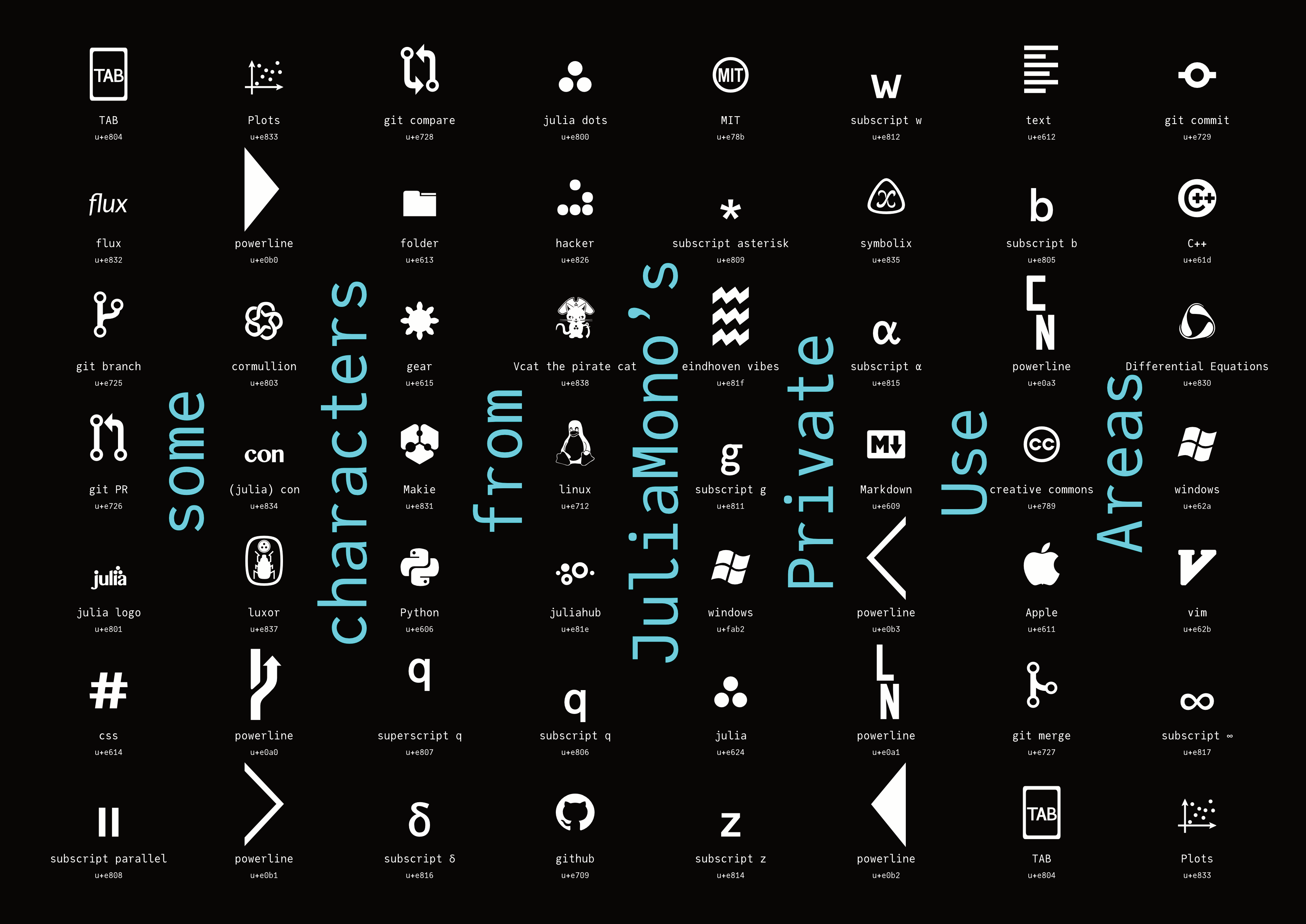
The obvious drawback to using characters in a Private Use Area is that you have to have installed the font wherever you want to see them rendered correctly, unless they’ve been converted to outlines or bitmaps. If the font isn’t installed (for example on GitHub), you have no idea what glyph — if any — will be displayed to other people.
Julia users: you can define these to be available at the REPL. For example, say you want the Julia dots to be available in the terminal when you type \julialogo in a Julia session with the JuliaMono font active. Run this:
using REPL
REPL.REPLCompletions.latex_symbols["\\julialogo"] = "\ue800"
Now you can insert the logo in strings by typing \julialogo :
julia> println("Welcome to ")
Welcome to It’s usually possible to type Unicode values directly into text. This is a useful skill to have when you’re not using a capable REPL. On MacOS you hold the Option (⌥) key down while typing the four hex digits (make sure you’re using the Unicode Hex Input keyboard). On Windows I think you type the four hex digits followed by ALT then X. On Linux it might be ctrl-shift-u followed by the hex digits.
Thanks!
Thanks to: Thibaut Lienart for his Franklin.jl web site builder; to Jérémie Knüsel who provided invaluable suggestions and advice; to Dr Zygmunt Szpak for his cool maths code; to Simeon Schaub for the issues and PRs, and to others in the Julia community for help and suggestions. Type sample from underscoretype.
Footnotes
| [1] | “licence” Although not MIT-licensed like Julia, JuliaMono is licensed using the SIL Open Font licence, which allows the fonts to be used, studied, modified, freely redistributed, and even sold, without affecting anything they’re bundled with. |
| [2] | “Windows” For more information about if and how it works on Windows, read this, but I currently don't know enough about Windows font technology and how it differs from MacOS and Unix. Early reports said that the font didn’t look good on Windows. This was because the format was CFF/PostScript OTF, which isn’t hinted on Windows. A switch to TTF/TrueType OTF, which is hinted, was considered an improvement. |
| [3] | “downloading font problems” The problem might be something to do with the web security feature called CORS which prevents a web page accessing the resources it needs. |
| [4] | “masters” In fact there are four masters (Light, Regular, Bold, and Black), and the other instances are interpolated between them. |
| [5] | “maths in code” spotted here |
| [6] | “languages” Apologies for errors - I don’t speak most of these languages. |
| [7] | “greedy” referencing this classic Julia blog post |
| [8] | “better fonts...” Operator Mono and Fira Code are excellent typefaces... Try them! Also try IBM Plex Mono, Iosevka, Recursive, and Victor Mono, to name just a few of my favourites. Like programming languages, every typeface has its strengths and weaknesses. |
| [9] | “not the only one” Matthew Butterick says “hell no” to them. He also uses the phrase “well-intentioned amateur ligaturists” which isn’t a label I want to have. But more seriously, he says: “my main concern is typography that faces other human beings. So if you’re preparing your code for others to read — whether on screen or on paper — skip the ligatures.” I don’t quite agree with Fira Code’s developer that they save your brain some milliseconds of recognition time; I find I have to double-check a combination to remember what it represents, or how many characters have been replaced. But your mileage might vary. |
| [10] | “alternate glyphs” Note that the substitute glyphs occupy the same width as the source glyphs they’re replacing. While you could in theory use one of the thousands of Unicode arrows, such as →, as a replacement for the ‘stabby lambda’ (->), these are the width of a single character, and so you’d be changing the width of your string/line whenever you made the substitution. |
| [11] | “Typography panel” These vary widely in their abilities and functions: the MacOS Terminal app’s Typography panel is comprehensive but I’m not convinced that all the buttons are wired up yet... |
| [12] | “terminals again” Writers of terminal apps usually have their own ideas about how fonts and type should be managed and displayed. I haven’t yet found one that did everything that I wanted it to and nothing I didn’t expect it to: wezterm is about the best, although configuring the macOS Terminal is a bit easier, ghostty is promising, and iTerm for macOS is a reasonable alternative. In the world of fonts, nothing is 100% correct, which can be frustrating. You can track some of the issues and discussions on GitHub and elsewhere: here’s a VS Code issue; here are the Alacritty terminal developers working on it; here is the iTerm documentation talking about performance. |