Frequently asked questions
- ‘Why⁉’
- ‘Where can I see it in action?’
- ‘I don’t like it as much as
$(my_favourite_font)’ - ‘How can I use the web fonts?’
- ‘How do I configure VSCode?’
- ‘How do I configure the CSS?’
- ‘Can I use this font in a Jupyter notebook? And how do I do it?’
- ‘Is it just for Julia coding? How does it “work well with” Julia?’
- ‘How do I use the font in plots, say in Plots.jl?’
- ‘Can I use it in a \( \LaTeX \) document?’
- ‘Aren’t these font files too big?’
- ‘How is this different from any other Unicode font?’
- ‘Where are the design notes? Don't typeface designers love talking about how it was designed?’
- ‘Where’s the source? What’s the licence?‘
- ‘Is it finished?’
- ‘Why don’t these accents/marks/diacritics work properly?’
- ‘Does it work on macOS?’
- ‘Does it work on Linux?’
- ‘Does it work on Windows?’
- ‘What about a nerdfonts version?’
- ‘What about JuliaSans?’
‘Why⁉’
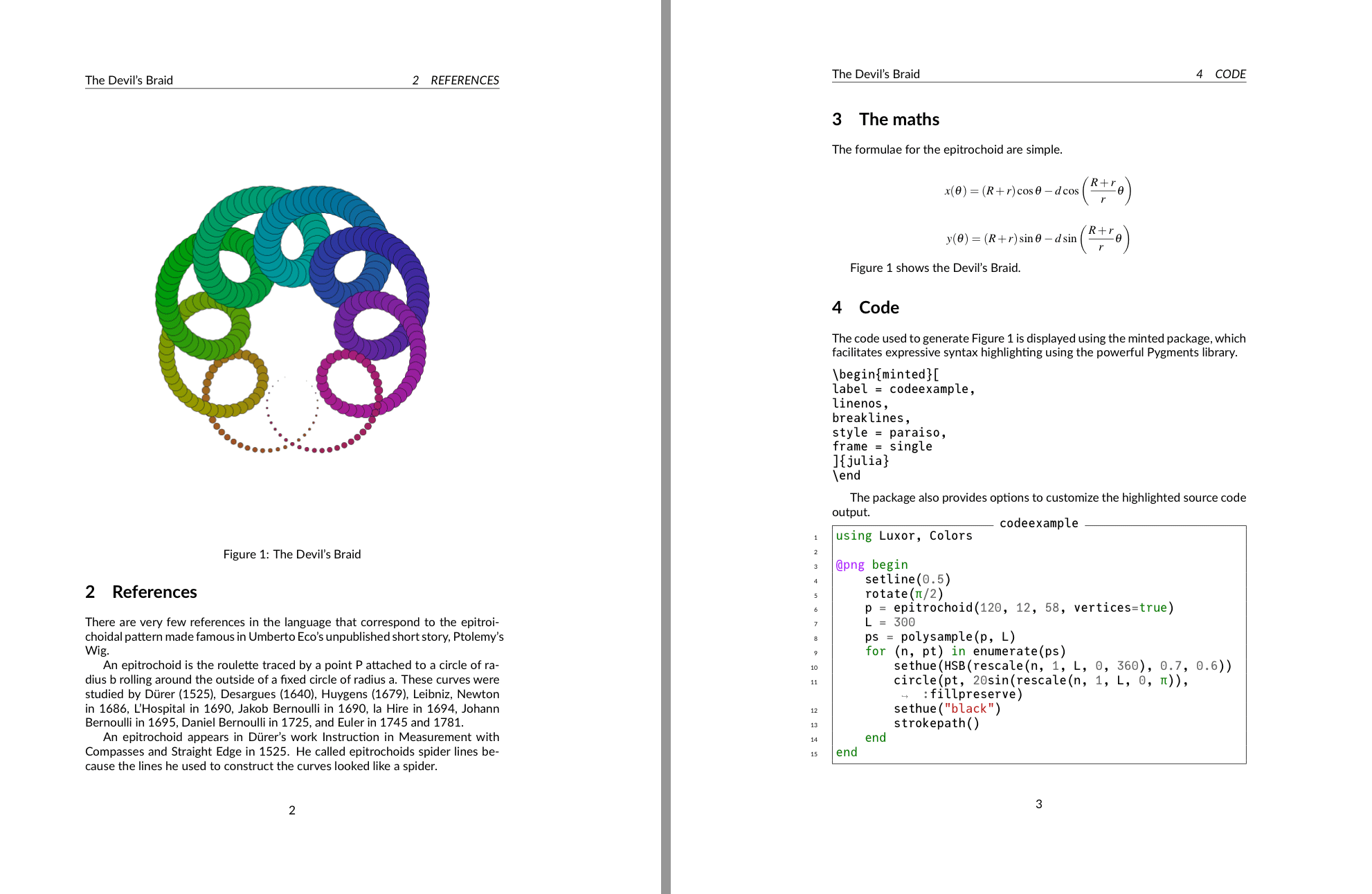
The typeface was introduced at the 2020 Julia Programming Language conference, JuliaCon (which was to be in Lisbon, Portugal, but a certain virus had other ideas) as my contribution to the festivities.
‘Where can I see it in action?’
Feel free to compare it with other fonts at dev fonts and www.programmingfonts.org.
If you use a lot of mathematics, visit the mono-math.netlify.app site, which shows how Unicode math symbols look in various fonts.
To find out about JuliaMono's Unicode support, you could look at the Glyphs page on this site, or you could visit glyphy.info and type a name (for example interrobang) or a hexadecimal number (for example 0x203d), If the glyph is present in JuliaMono, you'll see a checkmark ✓:
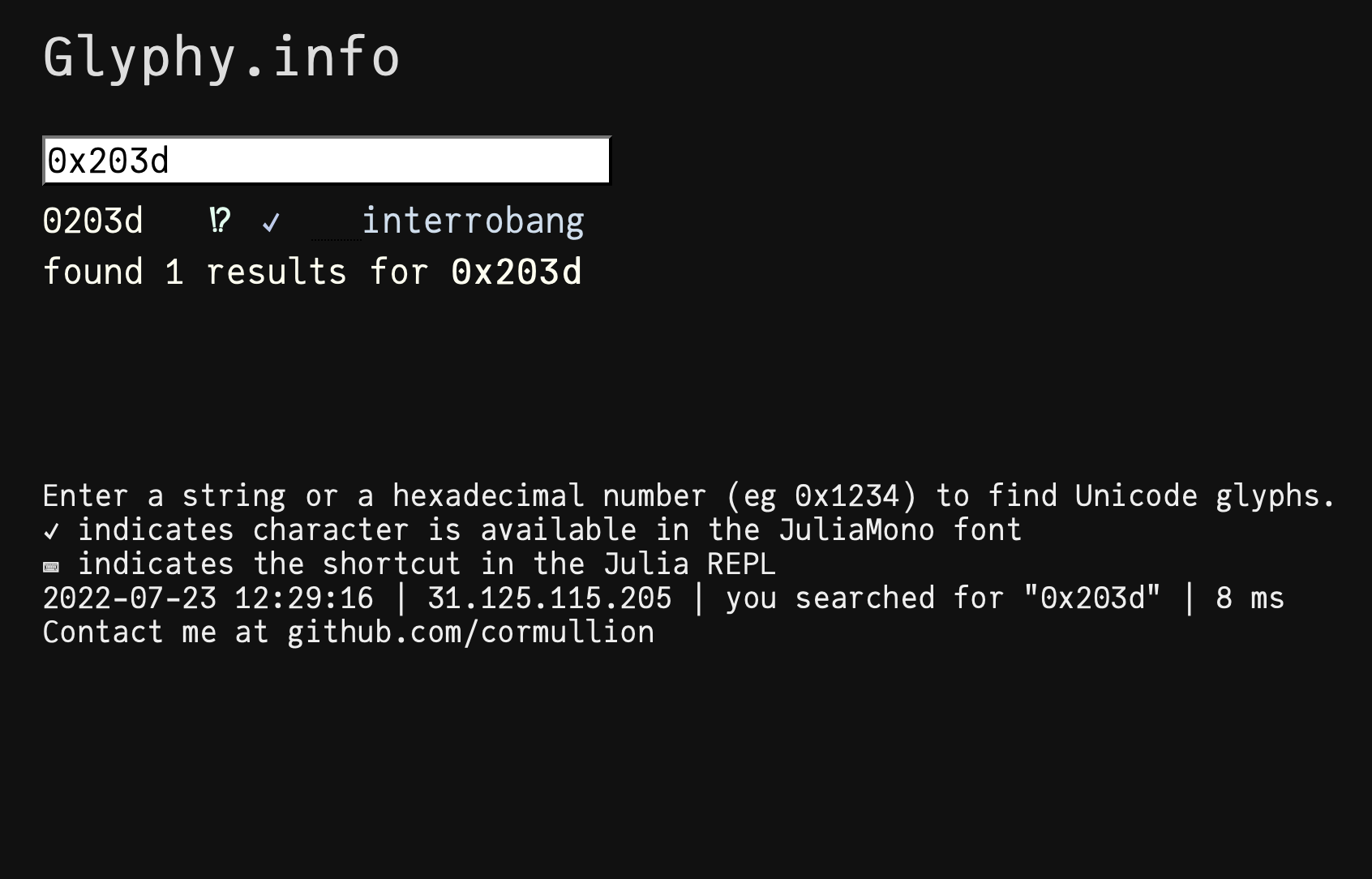
Julia users can also do this without leaving the REPL. Install the Glyphy.jl package in the usual way, and then run it like this:
julia> using Glyphy

julia> glyphy("interrobang")

0203d   ‽   ✓    interrobang
02e18   ⸘   ✓    inverted interrobang
1f679   🙹   ✓    heavy interrobang ornament
1f67a   🙺   ✓    sans-serif interrobang ornament
1f67b   🙻   ✓    heavy sans-serif interrobang ornament
 found 5 glyphs matching "interrobang"

julia> glyphy(0x203d)

0203d   ‽   ✓    interrobang
‘I don’t like it as much as $(my_favourite_font)’
That’s not a question! But I know what you mean. Choice of work environment (editor, font, colour scheme, background music, preferred beverage, etc.) is very much a personal thing, and over the hours, days, and weeks that you work with your particular setup, you’ll grow accustomed to it, and unfamiliar work environments will look unappealing or even ugly. You’d probably need to try any alternatives for a while before you get more accustomed to them.
‘How can I use the web fonts?’
Find a suitable CSS file, and insert a link to a WOFF2 file stored on a server. You can use the jsdelivr content delivery network as a server:
@font-face {
	font-family: JuliaMono-Light;
	src: url("https://cdn.jsdelivr.net/gh/cormullion/juliamono/webfonts/JuliaMono-Light.woff2");
}
Because we didn't specify a version number, we've been served with the current, most recent, release on GitHub. If for some reason you want to download a specific release, use a URL in the form:
https://cdn.jsdelivr.net/gh/cormullion/juliamono@0.63.2/webfonts/JuliaMono-Light.woff2Here we're asking for release 0.63.2 of JuliaMono-Light.woff2.
Then, in the area of the CSS where you control the appearance of monospaced text, use CSS like this:
pre {
	font-family: JuliaMono-Light;
}
code {
	font-family: JuliaMono-Light;
	}
You may prefer to serve the WOFF2 fonts from your own server. One problem you might encounter is related to Cross-origin resource sharing, which on some browsers prevents one web page from downloading fonts from another.
Some people use the path to the GitHub repository for JuliaMono in the src: url( part of the CSS file. I don't know whether relying on GitHub for performant or reliable file-serving is to be recommended...
There are some other options for the @font-face directive, which determine things like the behaviour of web pages while the fonts are still downloading, the range of characters you want to download, and so on.
(There are also versions of two of the fonts with “Latin” in the name: these are stripped down versions supporting just the basic MacRoman/Windows1252 “Latin” character sets. These are of interest mostly if you want to have more control over font loading times in web browser-based applications.)
‘How do I configure VSCode?’
In VSCode you’ll find the font settings somewhere in the labyrinthine (but thankfully searchable) Settings department.
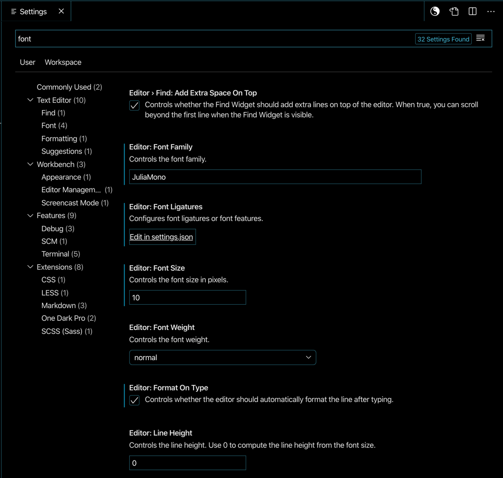
To control the display of contextual alternates and stylistic sets, click on the Edit Settings in JSON, and look for editor.fontLigatures:
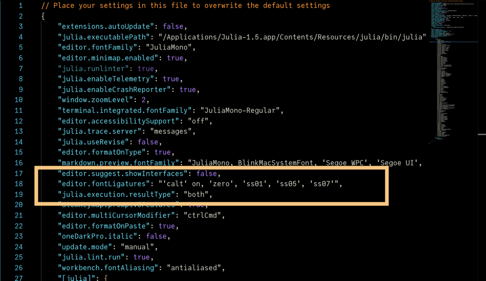
You use the OpenType feature codes (listed here). These should all be switched on or off in a single line, if you're editing the settings.json file.
For example, if you like a slashed zero, a single story g, and fancier HTML comments, you want zero, ss01, and ss13 to be switched on, so type:
"editor.fontFamily": "JuliaMono-Light",
    "editor.fontLigatures": "'calt' on, 'zero', 'ss01', 'ss13'",
But if you want to switch of the contextual alternates but quite fancy a lighter asterisk, use this:
"editor.fontLigatures": "'calt' off, 'ss05'",A tale of two TTYs
In VSCode there are two levels of OpenType font support, editor and terminal. They might be converging in terms of features, but they are still different in some key ways.
Editor windows support most OpenType features; you can ask for contextual alternates (ligatures), stylistic sets, alternate characters, and so on, using the feature codes listed above.
Terminal windows use the xterm.js terminal emulator. Previous iterations were not very powerful with regard to OpenType features such as ligatures, stylistic sets, and so on, but the situation is gradually improving. You can keep up to date with progress on GitHub.
‘How do I configure the CSS?’
In a CSS stylesheet, you can specify the appearance of the font. First, define the location of the online fonts:
@font-face {
    font-family: JuliaMono-Light;
    src: url("https://cdn.jsdelivr.net/gh/cormullion/juliamono/webfonts/JuliaMono-Light.woff2");
}
Then apply them to HTML elements using selectors and the following keywords:
p {
	font-family: JuliaMono-Light;
	font-size: 1.2em;
	font-style: normal;
}
You can switch off the contextual alternates (such as -> and =>) for a given selector with:
selector {
	font-variant-ligatures: no-contextual;
	}
Or on (if it’s not enabled by default) with:
selector {
	font-variant-ligatures: contextual;
	}
Control all features in a single line font-feature-settings. For example:
selector {
    font-variant-ligatures: no-contextual;
	font-feature-settings: "zero", "ss02";
	}
which switches off contextual alternates and enables the slashed zero (0) and the simpler "g" (g).
‘Can I use this font in a Jupyter notebook? And how do I do it?’
It’s a good question. Some browsers these days are reluctant to give you access to things stored on your own local disks, “for security reasons”. But a local copy of the font may be available and accessible on your particular set-up. If not, you could try using web fonts, as above. For example, if there’s a Jupyter CSS file here:
~/.jupyter/custom/custom.cssyou could add definitions like this:
@font-face {
	font-family: JuliaMono-Light;
	src: url("https://cdn.jsdelivr.net/gh/cormullion/juliamono/webfonts/JuliaMono-Light.woff2");
}

.rendered_html table{
    font-size: 16px !important;
}

div.input_area {
    background: #def !important;
    font-size: 16px !important;
}

div.output_area pre{
    background: #def !important;
    font-size: 16px !important;
    font-family: JuliaMono-Light;
}

.CodeMirror {
    font-size: 16px !important;
    font-family: "JuliaMono-Light" !important;
    font-feature-settings: "zero", "ss01";
    font-variant-ligatures: contextual;
}
which downloads the font once and is then available to applications.
‘Is it just for Julia coding? How does it “work well with” Julia?’
No, that's just the language I use. You can use the font for any purpose, with any language.
# In python3
# By default the encoding is "utf-8"
import sys

# printing the default encoding
print("The default encoding for python3 is:", sys.getdefaultencoding())

# to define string as unicode
# we need to prefix every string with u"...."
p = u"\u2119"
y = u"\u01b4"
t = u"\u2602"
h = u"\u210c"
o = u"\u00f8"
n = u"\u1f24"

# printing Python
print(p+y+t+h+o+n)
The default encoding for python3 is: utf-8
ℙƴ☂ℌøἤ
or APL (technically BQN):
⊑+`∘⌽⍟12↕2 # The 12th Fibonacci numberFor Julia specifically:
it has all the glyphs used in the Unicode Input chapter of the Julia documentation (except for the emojis)
a few of the glyphs and ligatures were designed with the Julia programming language in mind
the font contains special features such as contextual alternates, stylistic sets, and “ligatures” that complement Julia syntax
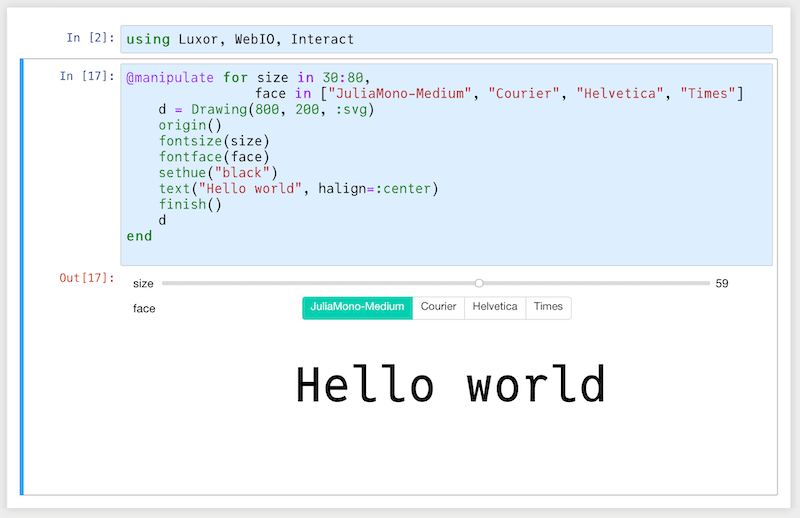
‘How do I use the font in plots, say in Plots.jl?’
Another great question. Are you sure you want a monospaced font on your plot? If you do, it should be easy enough to ask for the font when you plot. But it’s never as simple as you want it to be, as is usual in the world of fonts.
I know very little about plotting in Julia, but some investigations suggest that:
pyplot()works well, mostly, as does Makie.jlsome backends do their own thing with fonts. For example, I couldn’t persuade the GR backend to use JuliaMono at all.
Here’s some code that uses JuliaMono for a plot. The plot shows the frequency of occurrence of every Unicode character used in the Julia git repository, and uses the characters as plot markers. I went through every text file and totalled all the characters - there are 956044 letter “e”s, and so on. I’m using pyplot(); the freqs DataFrame holds the characters and the counts. I’ve created a few font objects using Plots.font(), which makes it easier to use different text styles in the plot() function. I haven’t yet worked out how to use the different weights of a font family.
using Plots, Plots.PlotMeasures
pyplot()
theme(:dark)
juliamonofont8 = Plots.font(family="JuliaMono", 8,
halign=:center, colorant"white")
juliamonofont12 = Plots.font(family="JuliaMono", 12,
halign=:center, colorant"white")
juliamonofont80 = Plots.font(family="JuliaMono", 80,
halign=:center, colorant"grey30")
annotation = "counting character frequencies\nin Julia source files "
p = plot(1:100,
freqs[1:100, 2],
fontfamily = "JuliaMono",
margin = 20mm,
yaxis = :log10,
annotation = [
(50, 1000, Plots.text(annotation, juliamonofont12)),
(80, 1_000_000, Plots.text("", juliamonofont80))
],
linewidth = 0.25,
series_annotations = Plots.text.(freqs[1:100, 1], Ref(juliamonofont8)),
xlabel = "← more frequent | less frequent → ",
ylabel = "occurrences (log scale) ",
labelfontsize = 6,
titlefontsize = 14,
formatter = :plain,
size = (800, 500),
title = "Top 100 characters\nin the Julia github repo ",
legend = false,
)
display(p)
The top 9 characters - “etanirsol” - are a good match for the typical English frequency count e.g. “etarionsh”. It’s to be expected that parentheses make a very good showing, here.
Although over 3600 unique characters occur in the Julia documentation, about 3000 of them appear just once. All of them, except the emojis which aren’t in JuliaMono, could be plotted, but the long tail isn’t very interesting visually.
For plotting emoji characters, you’ll have to dive into the internals of the plots system...
Notice that the y-axis labels are in DejaVu Sans, provided with matplotlib. That’s because the :log10 scaling code does its own \( \LaTeX \)-y business, ignoring the current font. However, at least I was able to insert the Julia logo successfully, since it’s part of the JuliaMono font.
‘Can I use it in a \( \LaTeX \) document?’
In a \( \LaTeX \) document, you should be able to define and use local fonts.
Robert Moss put together an excellent package to help negotiate the various font issues that you might encounter when using Unicode and \( \LaTeX \):
An earlier approach that worked for me is as follows:
In your \( \LaTeX \) source file, define the mono font and point to the local pathname:
\usepackage{fontspec}
\usepackage{unicode-math}
\usepackage[utf8]{inputenc}
\usepackage{minted}

\setmonofont{JuliaMono-Regular.ttf}[
    Path = /Users/me/Library/Fonts/,
    Contextuals = Alternate,
    CharacterVariant=1,
    Scale = MatchLowercase,
	BoldFont = JuliaMono-Bold.ttf,
	%Numbers = OldStyle
]
Then you can use something like minted to format the code.
(I used the lualatex engine.)
‘Aren’t these font files too big?’
It depends if you mean the web fonts or the ‘desktop’ fonts. Web fonts come in two flavours, .WOFF and .WOFF2, where the 2 indicates a more recent and slightly more compact format. JuliaMono-Light.woff2 is 837KB - the size of a PNG image, perhaps?
The .TTF versions are getting on for 3.5MB each. (See Does it work on Windows.)
For comparison, the Themes folder of .CSS files for the Julia manual (and for every manual built with Documenter.jl since v0.21) is about 700KB. So in that light the WOFF2 fonts aren’t that bad. Of course, the two Google fonts downloaded by every Julia document (Lato and Roboto) are tiny, at 14KB and 11KB, with 221 glyphs in each.
So, if you’re building a website, or designing for mobile applications, the size of the WOFF2 file(s) might be an important factor to weigh against the advantages of having predictable character sets. (This site is a bit of an exception, for obvious reasons.) Note that you can specify font subsets in the CSS using the unicode-range feature, which defines a restricted set of characters which you know are going to be used, so that users don’t download any that they won’t need.
You could consider using the ‘-Latin’ variants to obviate the initial loading time. These have a limited number of glyphs (restricted to the basic Latin character set), but will at least be quick to download.
‘How is this different from any other Unicode font?’
You’re right, of course, there are many coding fonts, all perfectly adequate for the task of programming in Julia and most other languages. Comparing two different fonts is a matter of how important small similarities and differences are. Perhaps with one font you’ll see the occasional empty box or odd replacement rather than the character you were hoping for. Or perhaps sometimes you won’t like a particular glyph.
More likely, though, the overall ‘feel’ of a new and unfamiliar font - too narrow, too wide, too dense, too light, too quirky, too dull, too consistent, too variable - is a matter of personal taste, immune to objective measurement.
Most people probably can’t tell the difference between Helvetica and Arial, and certainly aren’t going to be bothered about minor differences between JuliaMono and other coding fonts. But that’s fine. Just stick to your current favourites!
‘Where are the design notes? Don't typeface designers love talking about how it was designed?’
Oh, yes. Well, the design goals of JuliaMono were to make a programming font that's readable, easy to use, unquirky, simple, and including most of the characters (glyphs) required for modern scientific and technical programming.
Matthew Carter, the famous typeface designer, talks about how the aim when designing a font is to create “a beautiful set of letters” rather than “a set of beautiful letters”; the idea being that making the characters in the font harmonious and consistent with each other is of primary importance. But I would suggest that most typefaces, such as Matthew Carter’s familiar Georgia typeface, are designed to communicate prose in text languages such as English, German, or French - where the words are familiar recognizable units, and there’s much redundancy, such that predictability assists reading. You want the reader's eye to glide swiftly and easily over the page.
However, programming and coding typefaces have to address different problems:
code can often consist of sequences of non-language characters
a single variable name might combine Latin and Greek letters and various punctuation characters
often you want to compare areas of text with other areas (such as code laid out in tabular form)
sometimes the characters are placed so as to form larger patterns, such as bitstrings, or array contents
punctuation marks are no longer just hints to guide readers, but critical pieces of syntax that might completely alter the meaning of the surrounding text
the programmer doesn't read code in the same way that they would read prose
there’s much less redundancy in code: when reading prose you’ll find it easy to literally overlook misspellings and typos, but when working with code you’ll want to find the misspellings and typos - you don’t really want your eye to glide smoothly past these
So I'd argue that making letters easy to distinguish is as important as making them harmoniously consistent. A primary goal is to make characters that tend to be similar different. For example, in some fonts the digits 3, 8, and 0 have similar curved tops, so JuliaMono's 3 has a flat-top, and the 0 is more distinctive. The letters a, g, p, and q in many fonts often have the same round shape sitting on the baseline; by adopting the two-storey design for a and g there are two fewer letters to be confused. The asymmetries of characters like B and 8 have been enhanced. And so on.
The shapes aren’t compressed or condensed. The glyphs aren’t fashionably thin. It might feel quite “airy” because of the generous spacing. The punctuation is quite solid and possibly larger than you’d expect (my eyesight is probably poorer than yours!). Perhaps it’s not so good for non-code text (do you find this web page difficult to read?). One feature of JuliaMono is that there's some variability and inconsistency in the design; this is the result of human inadequacy :)
If you want to find out more about typeface and font legibility, a good place to start would be to see the work of Sophie Beier.
‘Where’s the source? What’s the licence?‘
The font is OFL/SIL-licensed, and you can find the source files (in Glyphs format) here. The SIL licence allows you to do almost anything you want, except re-issue it under the same name or with a different licence.
‘Is it finished?’
Some say that projects are never finished, just abandoned. As of July 2026, I’m still making small changes and fixes, and the current release is 0.63 (font version 0.063). Always download the latest version if you want the typeface to perform at its best. There will probably always be minor releases in the future, particularly if the Unicode Consortium introduce lots of new characters, and so the font will probably never be finished.
‘Why don’t these accents/marks/diacritics work properly?’
Unicode allows you to combine characters - place one above the vertically. For example, you can combine the glyph for e (U+0065) with the glyph U+20D7 (the “combining right arrow above”) to get:
e⃗In the Julia REPL, you can type a character and then add a combining mark using \( \LaTeX \) shortcuts. For example:
e\vecdisplays as
e⃗and the arrow mark is displayed above the character. There are lots of these combining marks (also diacritics) in Unicode (for example U+0300 to U+036F, U+20D0 to U+20F0, and others).
It’s possible to add more than one:
e\vec\dotwhich JuliaMono renders like this:
e⃗̇However, as usual, each terminal/application does its own thing, with varying results:
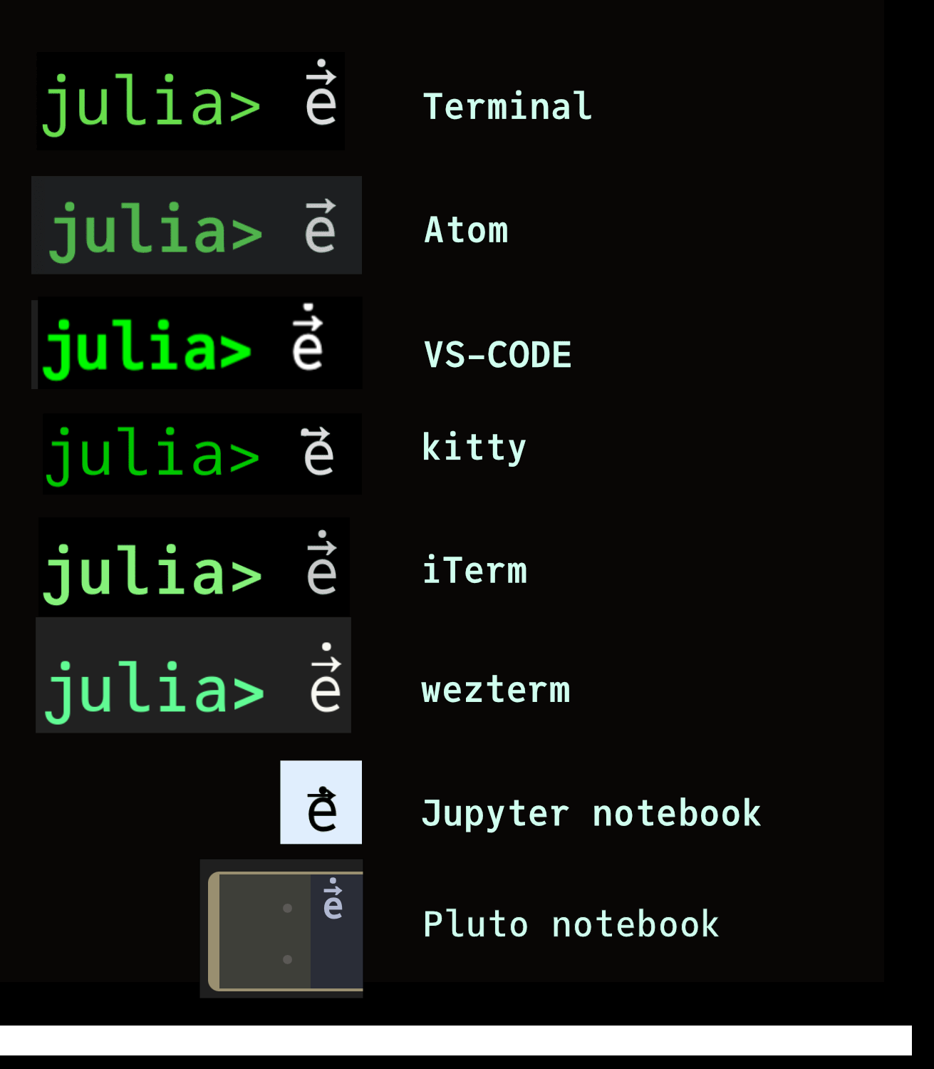
Some terminal applications and editing environments choose not to implement all OpenType features, often for performance reasons, and so they might not show all diacritics stacked above glyphs. Also, not all glyphs in all fonts allow the placement of diacritic marks above or below them. For example, the following atttempt to place diacritics on digits might or might not work well, depending on the font and the application (terminal/editor/browser) you’re using:
0̇1⃗2̂3̈4́5̀6́7̆8̊9̋You might be able to draw the Julia logo using these:
jul\iota\ddot\dotagiving:
julϊ̇aThe feature is subverted by zalgo text:
d̢̳̪̺̯͍̐ͮ̄̅ͤͬ͊̓͒̄́̀͠i̜̪͔͇̖͙͈͍̓̇̽͊͗a̢̧̝̳̻̣̫͖̹̟̬̲ͥͤͯ͑͐c͖̯̤ͨͩ͐ͣ̔͛︢͐͐͞ř̙ͮ͐̽ͨ͒i̧̡͙̳̫̦̫͓̱̜̜̼ͫ̆͢t̡̧̨̝̱̘̜ͥ̔̂ͮ̏ͤ︢͛ͭͪ̑̑͟͝͝ḭ̭̲̭̥͓̳͔̩̖̤̄̍̆͋́̎︢ͦ̽͘͜͟͟c̡̯͉̗ͮ̌̀͘͡͞͠"(This example was generated by Zalgo.jl.)
‘Does it work on macOS?’
Yes. JuliaMono works well, with most modern MacOS text editors, such as Visual Studio Code, Sublime Text, the excellent free CotEditor, Panic's Nova editor, BBEdit, and TextEdit, among others. If these editors support OpenType features such as stylistic alternatives and ligatures (not all do), these features of JuliaMono should work well.
‘Does it work on Linux?’
Yes.
Font management in Linux may require you to become familiar with the fontconfig program. And it may be necessary to provide an additional configuration file (in /etc/fonts/local.conf for example), that contains instructions like the following:
<alias>
    <family>monospace</family>
    <prefer>
	    <family>JuliaMono</family>
	</prefer>
</alias>
With some older terminal software, the ligatures and alternate characters may cause problems, or not work at all. Not all terminals choose to display ligatures, others are just confused by fonts that have them.
‘Does it work on Windows?’
The font works quite well on a good quality display, but will struggle to maintain quality when displayed on low-resolution displays.
On Windows, the shapes of letters are distorted in order to place the important features of letters on pixels, rather than ‘between’ pixels (which could make features disappear). On high-resolution displays, as found on Apple devices, it isn't necessary to distort letter shapes in this way. The distortion is controlled by a process called ‘hinting’. On Windows displays, you may find that there is unevenness and variations in thickness and alignments, particularly at smaller sizes and on lower resolution screens. This is due to the hinting process generating distorted shapes so as to target pixels.
JuliaMono is an OTF/TTF-flavoured font that contains hinting instructions. Hinted fonts are larger than OTF/CFF (PostScript-flavour) as a consequence.
‘What about a nerdfonts version?’
nerdfonts adds thousands of extra glyphs to a font. It does this by creating a new font that combines an existing font’s glyphs with a bunch of new ones, using a FontForge Python script.
You can download a Nerdfonts-enhanced version of JuliaMono here, thanks to the hard work of @mietzen!
‘What about JuliaSans?’
One day perhaps.